
Color Stories for 2026: Greens, Blues, and Earth Tones Dominate
Why Color Matters in the Kitchen
If you’ve ever walked into a kitchen and instantly felt calm, energized, or just plain happy, that’s no accident—color did the work. In 2026, greens, blues, and earth tones are leading the way, and we’re seeing homeowners lean into these palettes in Madison, Summit, and Chatham.
As Carly, our Senior Designer, likes to say:
“Color sets the mood before a single meal is made.”
Greens: Bringing the Outdoors In
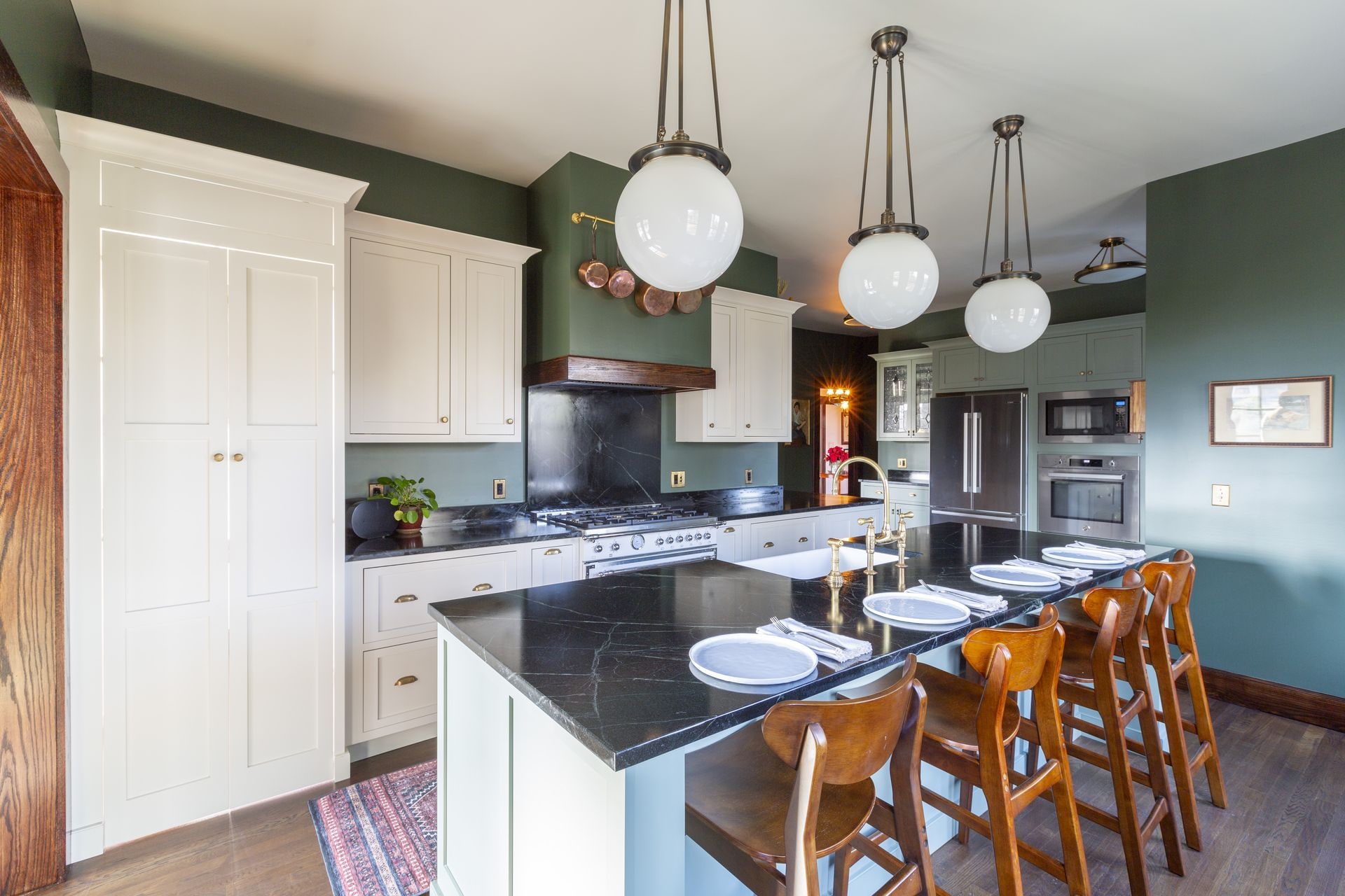
From soft sage to deep emerald, greens are everywhere. They feel natural, calming, and timeless. We’ve had Madison clients choose sage cabinetry paired with warm oak floors—it looks fresh but also feels like it’s always belonged.
In Summit, deeper tones like hunter or emerald give kitchens a rich, sophisticated look. Paired with brass or gold hardware, they instantly feel upscale.
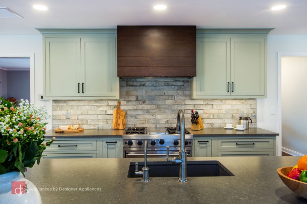
We’ve also seen homeowners in Florham Park bring in similar earthy green tones to keep their homes feeling fresh.
Blues: From Bold to Subtle
Blues are another big player. Navy islands with crisp white counters are a classic that never goes out of style. One Summit project featured a navy island topped with quartzite—it became the focal point of the entire first floor.
For homeowners who want something lighter, muted denim or dusty sky-blue tones add personality without overpowering the space.
Chris, our Project Manager, always says:
“A navy island is like a blue blazer—it works with everything.”
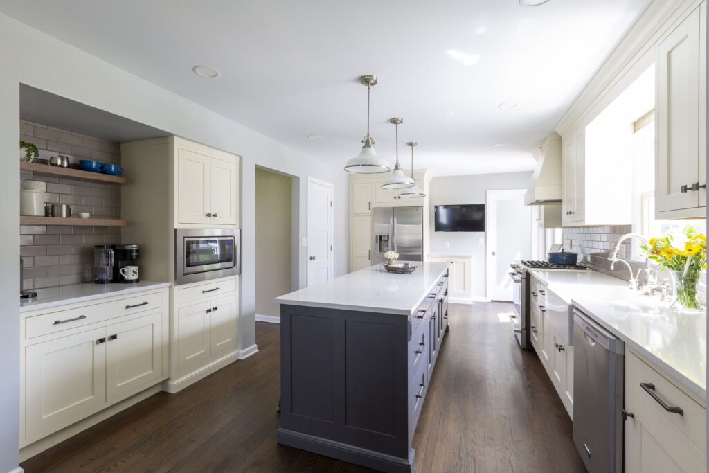
In Millburn, bold navy accents have become a favorite, especially paired with warm wood floors.
Earthy Neutrals: The New Foundation
We’re seeing a shift away from stark whites and cool grays. Instead, warm neutrals—beige, taupe, mushroom—are taking over. These tones add warmth, make small spaces feel cozy, and pair beautifully with natural wood or stone.
In Chatham Borough, one family chose a soft mushroom palette for their compact kitchen. The effect? It felt twice the size and far more inviting.
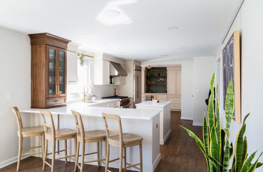
Berkeley Heights families are leaning into these same neutrals to make compact kitchens feel bigger and brighter.
Pairing Colors with Materials
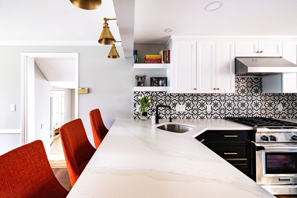
Color doesn’t stand alone. The right countertop, backsplash, and flooring make all the difference:
Rebecca, one of our designers, often points out:
““Texture is as important as color—it’s what makes a kitchen feel alive.”
What to Consider Before Choosing:
Choosing a color story isn’t just about what looks good today—it’s about how it will live with you. We always ask clients:
That’s why we often recommend mixing—keep your perimeter cabinetry neutral, then go bold on an island or backsplash. It gives you the best of both worlds.
Wrapping It Up
2026 is shaping up to be the year of calming greens, bold blues, and warm neutrals. These palettes don’t just look good—they create a feeling. They make kitchens welcoming, modern, and personal.
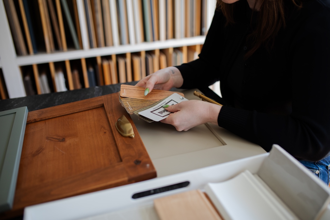
If you’re in Madison, Summit, or Chatham and thinking about refreshing your kitchen, come by our showroom. We’ll sit down, lay out samples, and find the palette that tells your story.
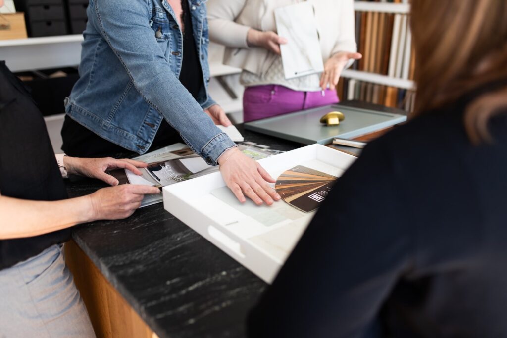
Your kitchen should look good, but more importantly, it should feel like you.
Ready to Reimagine Your Kitchen? Let’s Make It Happen!
At KraftMaster Renovations, we specialize in designing and building custom kitchens that combine function, flow, and refined design. Our team helps you choose the right layout, materials, and details to deliver the perfect, high-end kitchen.
Let our multi-generational family business turn your vision into reality—without the headaches. Stop by our showroom on Main Street in Chatham, grab a coffee, and let’s talk about your kitchen.